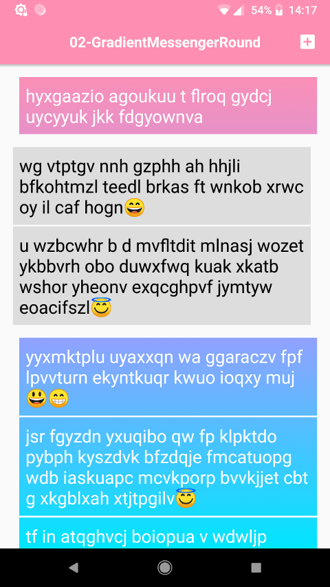
In the previous article we've implemented gradient background with fixed scrolling behavior. Similar effect can be seen in the Fa¢ebook Messenger app. Now it's the time to give our app some UI polish - we will add rounded corners to chat messages and introduce messages grouping. Most of the changes will happen in our custom RecyclerView.ItemDecoration which source can be found here. As a bonus point we will make our RecyclerView.ItemDecoration ready for RecyclerView.ItemAnimator animations.
Let's start with the grouping of messages. Messages from the same sender (be it me or you) will have smaller vertical margins between them. And messages from different senders will have bigger vertical margins. We are going to use the getItemOffsets method of our RecyclerView.ItemDecoration to do so. Also we need to make sure to remove all possible vertical margins specified in layout XML for chat messages (as we are going to process them dynamically):
// let's create a Config structure to hold required configuration properties
class Config(
        @Px val groupedMargin: Int,
        @Px val regularMargin: Int
)

class MessageDecoration(
        private val config: Config,
        private val meItemViewType: Int,
        private val youItemViewType: Int
) : RecyclerView.ItemDecoration() {

    override fun getItemOffsets(
            outRect: Rect,
            view: View,
            parent: RecyclerView,
            state: RecyclerView.State) {

        // clear offsets first
        outRect.set(0, 0, 0, 0)

        // we must have adapter in order to detect neighbors
        val adapter = parent.adapter ?: return

	    // we must also have `ViewHolder` to detect `itemViewType`
        val holder = parent.findContainingViewHolder(view) ?: return

        val itemViewType = holder.itemViewType

        // we will process only items that we are interested in
        if (itemViewType != meItemViewType && itemViewType != youItemViewType) {
            return
        }

        // if previous the same -> grouped margin-top else regular
        // if next the same -> grouped margin-bottom else regular

        // we will use adapter position to detect next & previous items
        // (they can be absent from layout at this point)
        val position = holder.adapterPosition

	    // if there is an item _before_ and it's from the same sender -> small margin
        outRect.top = if (position > 0
                && itemViewType == adapter.getItemViewType(position - 1)) {
            config.groupedMargin
        } else {
            config.regularMargin
        }

	    // if there is item _after_ and it's from the same sender -> small margin
        outRect.bottom = if (position < (adapter.itemCount) - 1
                && itemViewType == adapter.getItemViewType(position + 1)) {
            config.groupedMargin
        } else {
            config.regularMargin
        }
    }
}

Now we are going to add rounded corners for chat messages. In order to enhance the grouping we will apply the following corner radius logic:
- if a message has a message from the same sender above (before):
-
meTL (top-left) grouped corner radius
-
youTR (top-right) grouped corner radius
- if a message has a message from the same sender below (after):
-
meBL (bottom-left) grouped corner radius
-
youBR (bottom-right) grouped corner radius
- in all other cases corner radius is regular
So, if there is only one message in a group — it will have regular radius for all corners.
Also, unlike in the previous article, we are going to draw me chat message background in the ItemDecoration itself. This will help us isolate drawing logic in one place. So we won't have to jump through multiple project files to apply a small tweak. And we are actually going to apply the same clipping logic for both me and you chat messages. So theoretically we can use another gradient for me chat messages also (or any other Drawable actually). But let's focus for a moment on the corners and update our configuration structure:
class Config(
        @Px val groupedMargin: Int,
        @Px val regularMargin: Int,
        @Px val groupedCornerRadius: Int,
        @Px val regularCornerRadius: Int,
        val meBackgroundDrawable: Drawable,
        val youBackgroundDrawable: Drawable
)
Okay, draw!
class MessageDecoration(
        private val config: Config,
        private val meItemViewType: Int,
        private val youItemViewType: Int
) : RecyclerView.ItemDecoration() {

    // path for items area (that will be clipped)
    private val path = Path()

    // rect to hold view dimensions
    private val rectF = RectF()

    // we cannot use @Px annotation with Floats, so make an explicit conversion
    private val groupedCornerRadiusF = config.groupedCornerRadius.toFloat()
    private val regularCornerRadiusF = config.regularCornerRadius.toFloat()

    override fun onDraw(c: Canvas, parent: RecyclerView, state: RecyclerView.State) {
        // todo
    }
}
Note
Unlike previous article we are using
Pathfor clipping as we want to have rounded corners for our chat messages. This cannot be achieved with a regularcanvas.clipRoundRectmethod because:
- it does not exist in Android API
- (but even if it did) we want to have different corners to have different radius
We will re-use most of the view-finding logic from the previous article:
override fun onDraw(c: Canvas, parent: RecyclerView, state: RecyclerView.State) {

    // we need adapter to check for neighbor items
    val adapter = parent.adapter ?: return

    var view: View
    var holder: RecyclerView.ViewHolder
    var itemViewType: Int
    var position: Int

    var previousItemTheSameType: Boolean
    var nextItemTheSameType: Boolean

    for (i in 0 until parent.childCount) {

        view = parent.getChildAt(i)
        holder = parent.findContainingViewHolder(view) ?: continue
        itemViewType = holder.itemViewType

        // process only message items
        if (itemViewType != meItemViewType && itemViewType != youItemViewType) {
            continue
        }

        val textView = (holder as TextViewHolder).textView

        // it's required for us to have x,y coordinates _relative_ to RecyclerView
        // also, convert to floats
        val (x, y) = textView.relativeTo(parent)
                .let { Pair(it.x.toFloat(), it.y.toFloat() }

        // the actual _fun_ begins here
    }
}
Next we will check for neighbors of a chat message to detect if we need to apply different radius for corners.
override fun onDraw(c: Canvas, parent: RecyclerView, state: RecyclerView.State) {

    /*...*/

        val (x, y) = textView.relativeTo(parent)
                .let { Pair(it.x.toFloat(), it.y.toFloat() }

        // position to obtain neighbors
        position = holder.adapterPosition

        // now, check if we have previous item of our type
        // then check if next one is of our type

        // should apply rounding to top
        previousItemTheSameType = position > 0
                && adapter.getItemViewType(position - 1) == itemViewType

        // should apply rounding to bottom
        nextItemTheSameType = position < (adapter.itemCount - 1)
                && adapter.getItemViewType(position + 1) == itemViewType

        // reset path
        path.rewind()

        // apply view bounds
        rectF.set(x, y, x + textView.width, y + textView.height)

        // a single message in a group
        if (!previousItemTheSameType && !nextItemTheSameType) {

            // just a regular rounded rect for all corners
            path.addRoundRect(rectF, regularCornerRadiusF, regularCornerRadiusF, Path.Direction.CCW)

        } else {
            // to be continued here...
        }

    /*...*/
}
Okay, having a rounded-rectangle with all corners sharing the same corner radius was relatively easy. Unfortunately we will have to draw the whole figure if we want to apply different radius to corners. Let's create an extension method for Path object to accept corner radius values and apply them. This extension method should also accept RectF as chat message view bounds:
private fun Path.addRoundRect(
        bounds: RectF,
        leftTopRadius: Float,
        topRightRadius: Float,
        bottomRightRadius: Float,
        bottomLeftRadius: Float) {

    // we will be drawing from left-top
    // we must init position to be between left-top & bottom-left (x=0,y=height/2)

    moveTo(bounds.left, bounds.top + (bounds.height() / 2.0F))

    // the same for all corners
    val sweepAngle = 90.0F

    // inner helper function to add an arc starting at [x,y]
    fun arc(
            rectF: RectF,
            startAngle: Float,
            x: Float,
            y: Float) {
        this.lineTo(x, y)
        this.arcTo(rectF, startAngle, sweepAngle)
    }

    // anonymous lambda w/ immediate execution, please note that semicolon is required
    // after the execution call
    //
    // left-top
    {
        // |x| | |
        // | | | |
        val rectF = RECT_F.apply {
            val diameter = leftTopRadius * 2.0F
            set(
                    bounds.left,
                    bounds.top,
                    bounds.left + diameter,
                    bounds.top + diameter)
        }
        arc(rectF, 180.0F, rectF.left, rectF.top + leftTopRadius)
    }();

    // top-right, bottom-right and bottom-left corners handling is omitted for brevity
    /*...*/
}
With that in place let's detect corner radius values for a chat message and add a rounded rectangle to the path:
override fun onDraw(c: Canvas, parent: RecyclerView, state: RecyclerView.State) {

    /*...*/

    for (i in 0 until parent.childCount) {

        /*...*/

        // a single message in a group
        if (!previousItemTheSameType && !nextItemTheSameType) {

            // just a regular rounded rect for all corners
            path.addRoundRect(rectF, regularCornerRadiusF, regularCornerRadiusF, Path.Direction.CCW)

        } else {

            if (itemViewType == meItemViewType) {
                // our extension method
                path.addRoundRect(
                        rectF,
                        // `ternary` is a simple extension function on Boolean
                        previousItemTheSameType.ternary(groupedCornerRadiusF, regularCornerRadiusF),
                        regularCornerRadiusF,
                        regularCornerRadiusF,
                        nextItemTheSameType.ternary(groupedCornerRadiusF, regularCornerRadiusF))
            } else {
                // our extension method
                path.addRoundRect(
                        rectF,
                        regularCornerRadiusF,
                        previousItemTheSameType.ternary(groupedCornerRadiusF, regularCornerRadiusF),
                        nextItemTheSameType.ternary(groupedCornerRadiusF, regularCornerRadiusF),
                        regularCornerRadiusF)
            }

            // although it's not required, let's still close the path
            path.close()
        }

        /*...*/
    }
}
For those who are interested ternary extension method is implemented like this:
private fun <T> Boolean.ternary(left: T, right: T) = if (this) left else right
Although we are deep down in to the onDraw method we still haven't drawn anything yet. Let's fix that. As we've already done most of the heavy lifting drawing is actually going to be easy:
override fun onDraw(c: Canvas, parent: RecyclerView, state: RecyclerView.State) {

    /*...*/

    for (i in 0 until parent.childCount) {

        /*...*/

        // process only message items
        if (itemViewType != meItemViewType && itemViewType != youItemViewType) {
            continue
        }

        /*...*/

        // apply view bounds
        rectF.set(x, y, x + textView.width, y + textView.height)

        // a single message in a group
        if (!previousItemTheSameType && !nextItemTheSameType) {

            // just a regular rounded rect for all corners
            path.addRoundRect(rectF, regularCornerRadiusF, regularCornerRadiusF, Path.Direction.CCW)

        } else {
            /*...*/
        }

        // draw item
        c.withSave {

            // clip prepared path
            c.clipPath(path)

            // we
            val drawable = if (itemViewType == meItemViewType) {
                config.meBackgroundDrawable
            } else {
                config.youBackgroundDrawable
            }

            // ensure drawable bounds
            // previously we were listening for RecyclerView onGlobalLayout events,
            // but as drawable bounds are lazy (it checks if bounds have changed internally)
            // we are safe to set them each time
            drawable.setBounds(0, 0, parent.width, parent.height)

            // draw it
            drawable.draw(c)
        }
    /*...*/
}
There is a Canvas.withSave extension method which looks like this:
private inline fun Canvas.withSave(action: Canvas.() -> Unit) {
    val save = this.save()
    try {
        action()
    } finally {
        this.restoreToCount(save)
    }
}
So, with all this in place we should have a working solution already. Do we?
Alright-alight, calm down. Yes, we do. If you launch the app now you will (finally) see the working implementation
[Bonus] Animations
Our implementation lacks few details but the most important one (at least for a chat application) is the appearance animation of new messages. Good news is — there are only few lines that we should modify in order to be RecyclerView.ItemAnimator ready:
- we must take into account the
translationYproperty of a chat message view - we must take into account the alpha property of a chat message view
override fun onDraw(c: Canvas, parent: RecyclerView, state: RecyclerView.State) {

    /*...*/

    for (i in 0 until parent.childCount) {

        /*...*/

        // it's required for us to have x,y coordinates _relative_ to RecyclerView
        // convert to floats
        // apply translationY for item animations (as we know that we operate on a vertical list)
        // if we would operate on a grid then translationX should also be taken into account
        val (x, y) = textView.relativeTo(parent)
                .let { Pair(it.x.toFloat(), it.y.toFloat() + view.translationY) }

        /*...*/

        // draw item
        c.withSave {

            // clip prepared path
            c.clipPath(path)

            /*...*/

            // calculate alpha that will be applied to items (for appear/disappear animations)
            drawable.alpha = (view.alpha * 255.0F + 0.5F).toInt()

            // draw it
            drawable.draw(c)
        }
    }
}
[Bonus] Me background
As I had mentioned we can use any Drawable for me chat messages (and have the same fixed background scrolling behavior). Here's an example of what can be done with that:
Source code can be found here
